













Ambigrams: how to create a double-reading lettering in the Ambigramania service
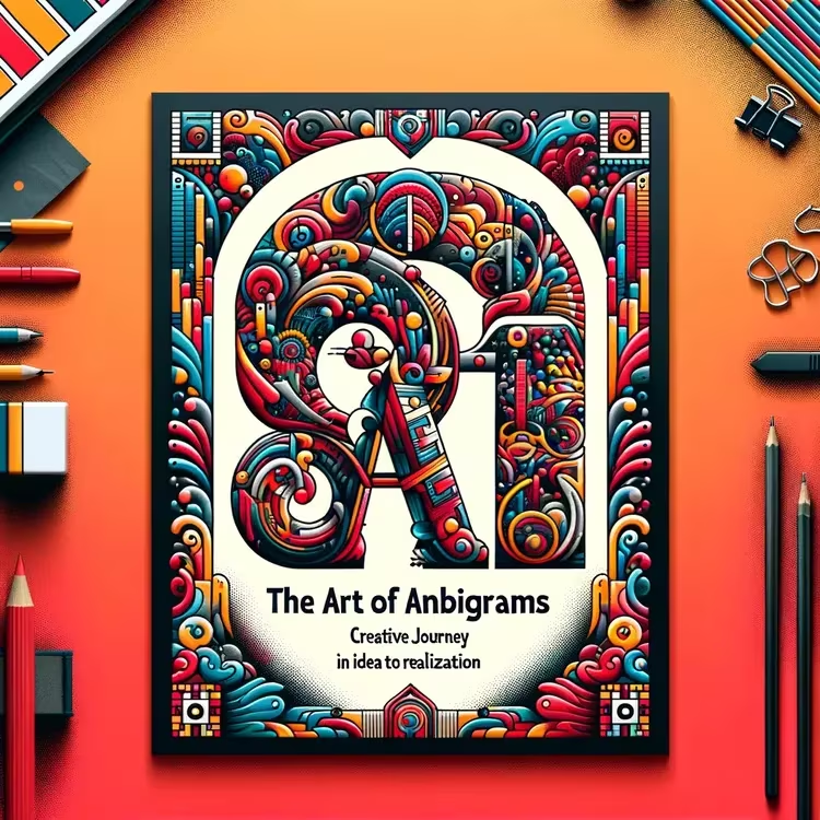
An ambigram reads from two sides. You flip the inscription upside down and see a different word or the same one. That is how typography works when meaning is encoded in the shape of the letters.
Such inscriptions appear in logos, tattoos, and book covers. You can create your first one yourself if you understand the principle of symmetry. Below we will look at what an ambigram consists of, what types exist, and how to make your own inscription in an online generator.
What ambigrams are
An ambigram is a calligraphic composition that gives two or more different readings depending on orientation. Most often it is a visual palindrome built on symmetry: the word stays the same when rotated or turns into a second word.
The term was coined in 1983 by the American researcher Douglas Hofstadter, author of a book about patterns and thinking. He also formulated the essence: one spelling carries two different readings (according to Wikipedia). Before him, such inscriptions were called "vertical palindromes."
💡 In short:
- An ambigram gives a second reading where you see one inscription.
- The rotational version reads from top and bottom, while the mirror version relies on reflection.
- A classic example of a rotational ambigram: the English word "swims."
- Your own inscription can be assembled in a browser-based generator in a few steps.
- Generator capabilities and terms of use: 10/2026, according to the Ambigramania website.
How ambigrams work: rotations and reflections
There are more than a dozen types of ambigrams, but a few principles underlie them all. The main difference is how you get the second reading: by rotation, reflection, or a shift in perception.
Ambigram type | How it reads |
|---|---|
Rotational | the inscription is flipped upside down, the meaning stays the same or changes |
Mirror | letters read in reflection, along a vertical or horizontal axis |
Figure-ground | letters and the spaces between them produce two different words |
Chain | the end of the first word becomes the beginning of the second |
Perceptual shift | one form reads two ways when the viewpoint changes |
A rotational ambigram relies on rotational symmetry. This is the most recognizable type, and it is most often shown as a flip word. Mirror ambigrams need reflection along a vertical or horizontal axis, so in real life they work next to a reflective surface.
Natural ambigrams stand apart: some words read upside down on their own without edits, and artists value such forms as a ready-made foundation. Figure-ground requires a different skill, because you design not the letters but the space between them.
The Ambigramania service: what it can do
Among online generators there is the Ambigramania service: here you can create an ambigram right in the browser, with no installation or registration. The service offers six canvas sizes from 320×240 to 1920×1080 pixels and three fonts, including versions for Full HD.
It works step by step. You choose the resolution and font, set the background color and text color, then enter a word and start generation. After that, the image can be downloaded and used as you see fit.
According to the service, finished works may be used in commercial projects, including logos and merchandise. The design draft is saved, so you can return to the settings later and refine the inscription.
How to create an ambigram step by step
Your first inscription is easier to assemble in a generator than to draw by hand. You enter a word, choose a font and color, and the algorithm rebuilds the letters for rotation. Development takes minutes, not evenings.
The sequence is as follows:
- choose a canvas size for your task;
- select a font from the set;
- set the background color and letter color;
- enter a word or short phrase;
- start generation and evaluate the result;
- download the file and save it.
If you do not like the result, change the font rather than the word. Some typefaces produce clean symmetry, others break the form. Sometimes changing a pair of letters in the word helps.
Where ambigrams are used
An ambigram works where an inscription needs to be memorable. It is most often used for logos, tattoos, book covers, and posters. Designers value such forms for the double message in a single composition.
- Logos and signage. A symmetrical word sets a brand apart from straight inscriptions.
- Tattoos. The design reads both ways and remains a mystery to others.
- Clothing and merch. A print on a T-shirt or mug works as a personal mark.
- Covers and illustrations. An ambigram adds intrigue to a book.
- Education. Teachers show such inscriptions to explain symmetry and typography.
The range of applications is wider than it seems at first glance. In advertising, an ambigram strengthens a slogan, and in puzzles it becomes a challenge for the reader. Psychologists study them as an example of dual perception.
Limitations and common mistakes
Not every word turns into a beautiful ambigram. Short words with even letters work best, while long phrases have to be split into parts. The service itself warns about this too.
- Bad letters. Soft, round, and slanted characters break symmetry.
- Long phrases. They are split into short symmetrical segments.
- Rotation only. Not every design reads in a mirror, and vice versa.
- Automation without edits. The generator gives a foundation, while precise finishing is done by hand.
- Someone else's work. If you use someone else's design as a base, check the rights.
A separate mistake has to do with expectations. People expect the generator to produce a perfect inscription on the first try. In practice, preparing the word takes more time than the generation itself.
⁉️🤔 Frequently asked questions
Which words work best for an ambigram?
Short words with even and symmetrical letters work best, because they are easier to read from two sides. Long phrases are assembled from several short segments, and each one is checked separately. Experiment matters more than rules here: try different fonts and letter orders. A good foundation is often found by trial and error, not on the first attempt.
How is an ambigram different from a palindrome?
A palindrome reads the same from the beginning and from the end at the letter level. An ambigram adds graphics to that: the meaning changes due to rotation or reflection, and sometimes simply due to a shift in viewpoint. So not only the order of characters matters, but also their shape. Some ambigrams are also palindromes at the same time.
Can an ambigram be used for commercial purposes?
Yes, if you created your own design. The service allows using its works including in logos, on clothing, and on merchandise. If someone else's design is used as a base, first clarify the rights to it. Such a check protects both the author and the client.
Do you need designer skills to make an ambigram?
No. The online generator rebuilds the letters itself, and all you need is a word, a font, and a color. Professional skills will come in handy later, when you want to refine the design to perfection by hand. For a first inscription, a browser and ten minutes are enough.
Why do long phrases turn into ambigrams worse than short ones?
The more characters there are, the harder it is to preserve symmetry in each one, so a long string breaks the design. A short word gives the designer freedom, while a whole phrase constrains the form. That is why a phrase is split into short blocks and assembled into a composition from them. This way the inscription stays readable from two sides.
In short: how to make your first ambigram
Start simple. Choose a short word and an even font, then experiment.
- If you are making phone wallpaper, use a wide canvas size.
- If you are preparing a tattoo, go with high resolution and a clean typeface.
- If you need a logo, check whether the inscription reads both rotated and normally.
- If the word does not come together, change the font or shorten the phrase.
Before publishing, check the result with your own eyes: show the design from two sides and make sure both readings are legible. One short step saves you from redoing it later.

A small editorial team writing guides for independent travel. We travel ourselves, but we haven’t been everywhere, so we check prices, opening hours and how to get there against official sources.