
















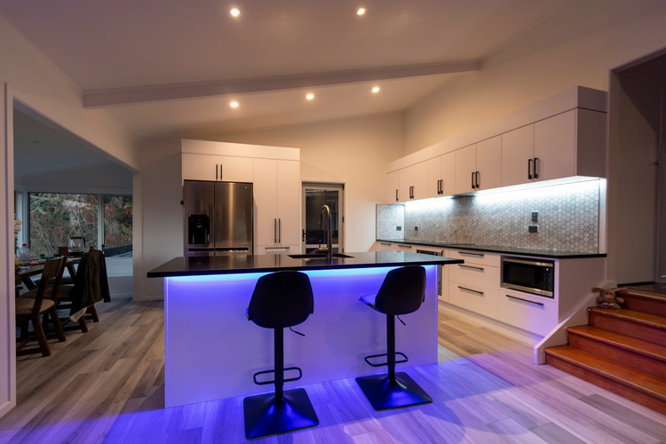
Kitchen tile: what to check before buying and how much extra to get
Kitchens take more wear than any other room in the house. Grease, steam, coffee stains, and constant humidity test the finishes every day. Tile here works not only as decoration but also as a protective layer that has to keep its look for years.
Choosing it is harder than it seems. Size, surface, abrasion class, and grout color all affect both appearance and upkeep. The international standard divides ceramic tile into groups by water absorption, and it is this group that decides whether a model is suitable for a wet area.
Next, we look at three things: which parameters matter most for you, how to tell a practical choice from a trendy one, and how much extra to allow if you are buying tile for the first time.
🧭 Why kitchen tile matters more than it seems
💡 In short:
- Walls, floors, and backsplashes need different tile, so first decide on the zone, and only then the material.
- For the work area, resistance to moisture, grease, and household chemicals matters.
- Tile water absorption groups: 10/2026, per the ISO 13006:2018 standard.
Ceramic, porcelain stoneware, and mosaic differ in water absorption, abrasion, and grip. Porcelain stoneware is pressed under high pressure, so it barely absorbs water and handles floor loads well. Glazed ceramic is easier to care for and is more often used on vertical surfaces. These differences determine where you can safely install your chosen collection.
Wall, floor, or backsplash: a quick orientation
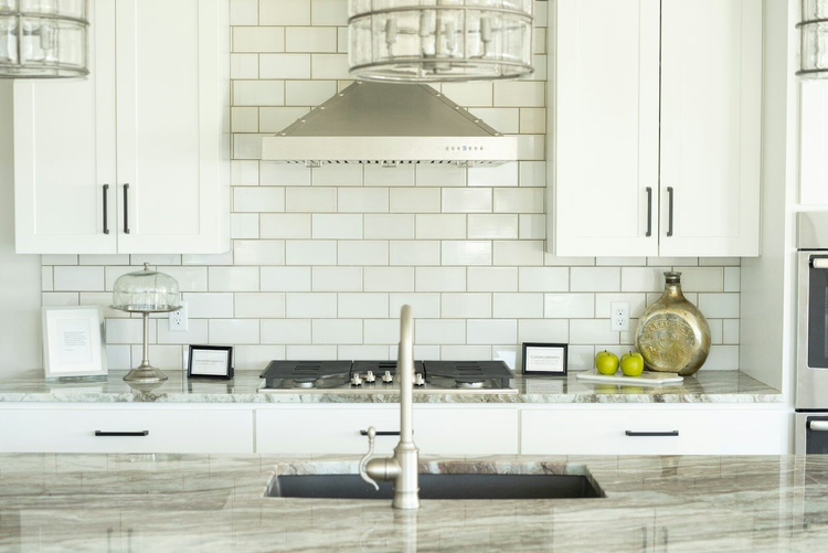
On the wall and in the backsplash area, cleanability comes first. A glazed surface keeps grease and water from soaking in, so stains come off faster. On the floor, abrasion and grip are what count: there the tile has to withstand chairs, shoes, pets, and frequent mopping. In an open kitchen, a large-format floor visually links the cooking area with the living room.
Important: the same collection is often made for both walls and floors, but not every wall tile will withstand floor loads. The manufacturer states the intended use in the specifications, and this is the first thing you should check.
📊 Types of kitchen tile: a comparison
Five options cover almost every kitchen need. They differ by density, format, and the number of grout lines. Below is a comparison by purpose and a measurable feature.
Option | Where to use | Measurable feature |
|---|---|---|
Porcelain stoneware (group BIa) | floor, open kitchen | very low water absorption |
Glazed ceramic | backsplash, wall | easy to clean, many decors |
Mosaic | niches, accent areas | flexible for curves and small areas |
Stone-look ceramic | designer kitchens | the look of stone without its upkeep |
Large format | minimalist kitchens | fewer joints, a calmer surface |
It is easier to browse the range through catalogs. The Vienna tile shop Fliesen & Dekor has put together a catalog of kitchen tile: wall and floor, in various formats (according to the site, checked 10/2026). The models differ in format, surface, and intended use, so comparing by specifications is quicker than choosing from a photo.
What suits a backsplash and what suits a floor
Porcelain stoneware almost always wins on the floor: it resists abrasion and does not fear wet cleaning. For a backsplash, people more often choose glazed ceramic, because it offers more color and pattern. Large format suits big walls and floors but needs a level substrate. If you are unsure, choose by zone: one collection rarely covers both floor and backsplash equally well.
⚖️ What to check in tile first
It is better to start not with color but with the conditions of use. A kitchen in a small apartment and a big family kitchen with an island call for different things: sometimes a light tone matters more, sometimes durability and grip. The technical data comes from the product datasheet, which lists water absorption, abrasion class, grip, and intended use. Check them before you fall for a pattern.
Indicator | Benchmark | Why it matters | Source |
|---|---|---|---|
Water absorption group BIa | no more than 0.5% | dense porcelain stoneware for heavily used floors | |
Abrasion class PEI 3 or PEI 4-5 | normal or heavy traffic | PEI 3 is enough for a home, go higher with children and pets | product datasheet |
DCOF grip | no lower than 0.42 | protection against slipping on a wet floor | |
Share of joints | lower for large format | fewer lines, easier to wash | model specification |
Water absorption, abrasion, and slipperiness
The water absorption class shows how much water the tile takes in, and group BIa is the densest here. The PEI class describes how well the glaze resists wear. Slipperiness is assessed by the DCOF value. All three numbers are gathered in the table above, and they rule out unsuitable options before you even choose a decor. You can verify them directly in the model's datasheet.
Care, grease, and everyday life
A kitchen is not a showroom, and that is fine. Tomato sauce, steam, water marks, and crumbs land on surfaces every day, and tile has to put up with it. For a backsplash, choose smooth or lightly textured surfaces: they wipe clean faster than deep relief. Gloss looks smart but shows fingerprints and splashes more. Matte surfaces are calmer, but with pronounced texture they take more thorough cleaning.
🏠 Which tile suits which type of kitchen
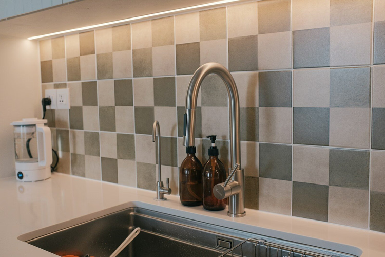
In a small kitchen, light wall tiles bounce light back and do not feel heavy. In an open kitchen, large format on the floor links the cooking area with the living room more calmly. For a country-style kitchen, warm beige tones and a slightly uneven edge work well. Your choice depends on the floor area, your habits, and how much light reaches the room.
Situation | Solution | Why | Watch out |
|---|---|---|---|
Small rental kitchen | light ceramic on the wall | visually lighter, easy to combine | do not overload with pattern |
Family kitchen | porcelain stoneware on the floor | handles daily wear | check the grip |
Designer kitchen | large-format stone look | calm, even surface | neat installation matters |
Budget renovation | classic subway tile | timeless and affordable | plan the grout color |
Kitchen with an island | matte floor | pleasant to walk on, less glare | the texture should not be rough |
Strengths and weaknesses of the material
Tile combines durability with freedom of design. One material can look Mediterranean, minimalist, or warm, and still handle splashes with ease. The weak point lies elsewhere: the result depends on the joints, the substrate, and the quality of installation. These are what decide whether the surface looks expensive or restless.
🎨 Color, format, and grout in the kitchen
Tile changes a room not only through its pattern but also through its format. A small format suggests handwork and rhythm, while a large one looks calmer and more modern. Look separately at how daylight falls on the surface: the same beige tone seems soft in the morning, cold at midday, and almost golden in the evening. That is why a sample should be judged in the kitchen itself, not on a screen.
Feature | Small format | Large format | Mosaic | Subway tile |
|---|---|---|---|---|
Impression | lively, detailed | calm, spacious | decorative, flexible | classic, urban |
Share of joints | high | low | very high | medium |
Care | more care for joints | usually easier | takes effort | easy to maintain |
Installation | flexible | needs a level substrate | precise preparation | tried and tested |
Best zone | wall, accent | floor, large walls | niches, curves | backsplash |
Why grout color is often underestimated
Grout works not as a technical detail but as a design tool. Light grout makes the surface softer, but it darkens faster in the work area. Dark grout emphasizes the grid and suits graphic kitchens, for example white subway tile with black hardware. Grout matched to the tile looks calmest and works when your surface should remain the main accent.
🛠️ How to choose tile: checklist and calculation
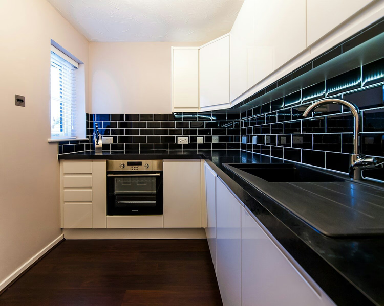
Before buying, you should check five points: load, care, safety, lasting design, and installation quality. Beautiful tile loses its point if it is slippery or hard to clean. Conversely, plain matte tile lasts for years if the format, color, and joint are planned in advance.
Checklist before buying
- Which zone is the tile made for: floor, wall, or both?
- Is the surface suitable for cleaning with water, grease, and steam?
- Is there data on water absorption, abrasion, and grip?
- Does the grout color go with the countertop, cabinet fronts, and floor?
- Is a realistic allowance included for cutting and replacement?
Allowance for cutting and sizes
Tile is never calculated with no spare: batches may differ slightly in tone and size, and the difference shows only after installation. For a straight layout, people usually add about 10%, for a diagonal one 15%, and for herringbone up to 18% (according to MakeCalcs). This is not wasted money but insurance against breakage, cutting, and future repairs.
✨ Design ideas that do not get old
Kitchens that do not try to show every trend at once work better. A calm floor, a characterful backsplash, and good light already give a sense of order. Warm natural tones, matte surfaces, and clean lines look convincing. Put bold choices such as geometry or deep green in a single zone: a niche, the backsplash, or the area behind the stove.
Durability and a responsible choice
Ceramic wins thanks to its service life. A surface that lasts for decades does not need constant replacement, and that is part of a sensible approach to renovation. What matters is not only the material but also choosing outside passing trends: extreme shades are more often replaced for aesthetic reasons. So go for solutions with character that do not look tired after a season.
⁉️🤔 Frequently asked questions
Which tile is best for a kitchen floor?
For a kitchen floor, people more often choose porcelain stoneware: it is dense, durable, and easy to clean. Check the floor rating, the abrasion class, and the grip. Dense porcelain stoneware barely absorbs water, and for a wet floor look for a DCOF of no less than 0.42 (per ANSI A326.3).
Are glossy tiles practical in a kitchen?
Gloss makes a kitchen brighter and smarter-looking. In daily use it shows splashes, fingerprints, and water marks more than a matte surface does. That is why gloss suits walls better than a heavily used floor. If you want gloss on the floor, choose a model with proven grip.
What tile color should I choose for a small kitchen?
Light tones such as cream, sand, light gray, and warm white visually widen the space. Pair them with a calm grout so the surface does not look busy. Then even a compact kitchen feels more open, and it is easier for you to choose furniture.
Is large-format tile harder to install?
Large format needs a very level substrate and precise work. In return, once installed the surface looks calmer and more expensive, because there are fewer joints. Find out in advance whether the substrate is ready for such a size, so you do not have to redo the work.
Which grout is easier to maintain?
Very light grout looks fresh but darkens faster in the cooking area. A medium gray or tile-matched grout is a good compromise between looks and practicality. You should keep a product for regular joint cleaning on hand.
Can wall tile be laid on the floor?
Only if the manufacturer explicitly allows it for floors. Wall models are often not designed for pressure, abrasion, and the load of foot traffic. Check the product specifications before moving a tile from the wall to the floor.
How much extra tile should I buy?
For a straight layout, an allowance of about 10% for cutting, breakage, and repairs is usually enough. For a diagonal layout, many corners, or a complex plan, allow more, up to 15-18%. The exact percentage depends on the chosen layout and the tile size.
Which options look timeless?
Stone-look, calm concrete, restrained beige, warm gray, and classic subway tile age gracefully. They are easier to match later with new cabinet fronts, hardware, and countertops. You will not want to change such tile after a couple of years.
In short: how to choose kitchen tile
Kitchen tile is first of all a working material, so a good choice rests on common sense, not on the loudest trend. First decide on the zone, then check water absorption, abrasion, and grip, and only then choose color and format.
The rule of thumb is simple. If you have a small rental kitchen, choose light ceramic for the wall. If you have a big family and cook every day, put porcelain stoneware with proven grip on the floor. If you want an expressive kitchen, keep a single accent: the backsplash, a niche, or the area behind the stove.
Before paying, check the specifications in the model's datasheet and allow extra for cutting. That way the surface will both look good and work well for years.

A small editorial team writing guides for independent travel. We travel ourselves, but we haven’t been everywhere, so we check prices, opening hours and how to get there against official sources.